
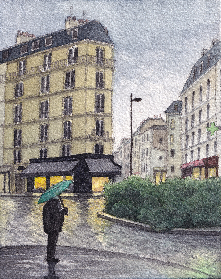
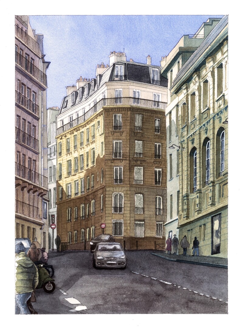
Place Saint Medard, Paris
Watercolor Painting, 2025
Arches Fine Grain 10×12.5cm 300gsm
Rotring 800 Mechanical Pencil + Winsor & Newton Professional Watercolors + Schmincke Watercolors
Limited Run Prints available HERE
Place Saint Medard, Paris
Watercolor Painting, 2025
Arches Fine Grain 10×12.5cm 300gsm
Rotring 800 Mechanical Pencil + Winsor & Newton Professional Watercolors + Schmincke Watercolors
Limited Run Prints available HERE
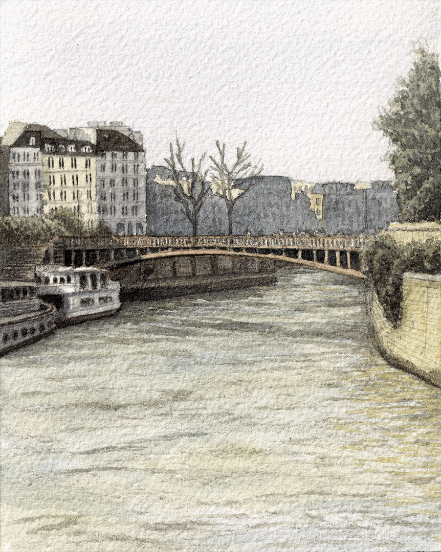
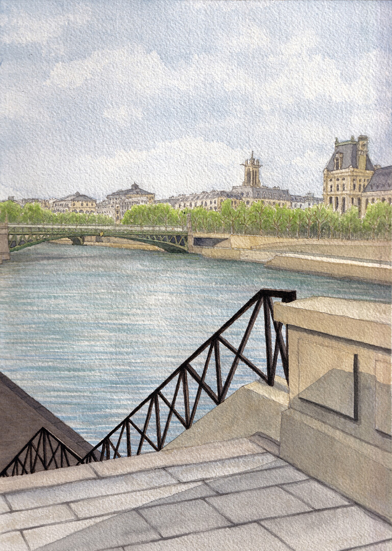
Pont au Double, Paris
Watercolor Painting, 2025
Arches Fine Grain 10×12.5cm 300gsm
Rotring 800 Mechanical Pencil + Winsor & Newton Professional Watercolors + Schmincke Watercolors
Prints available HERE
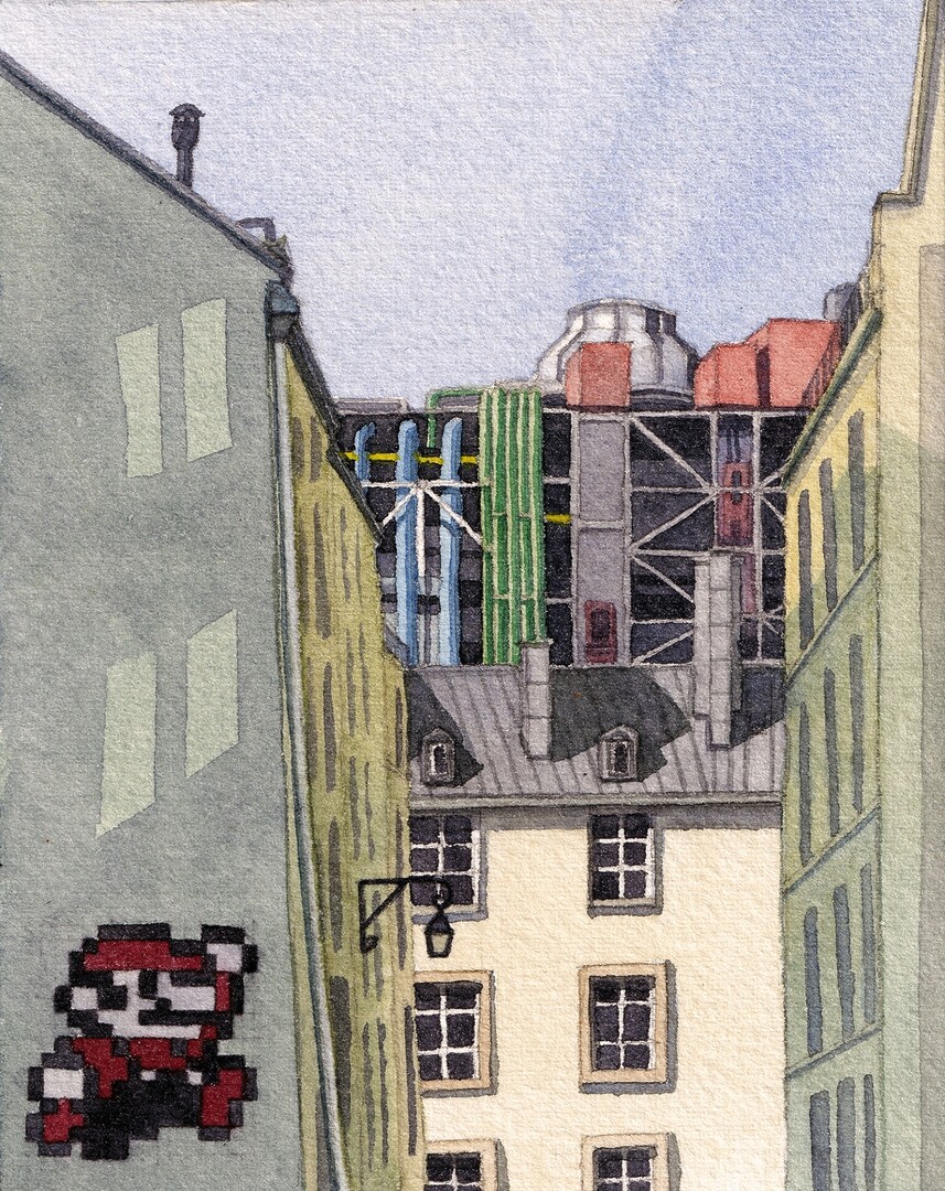
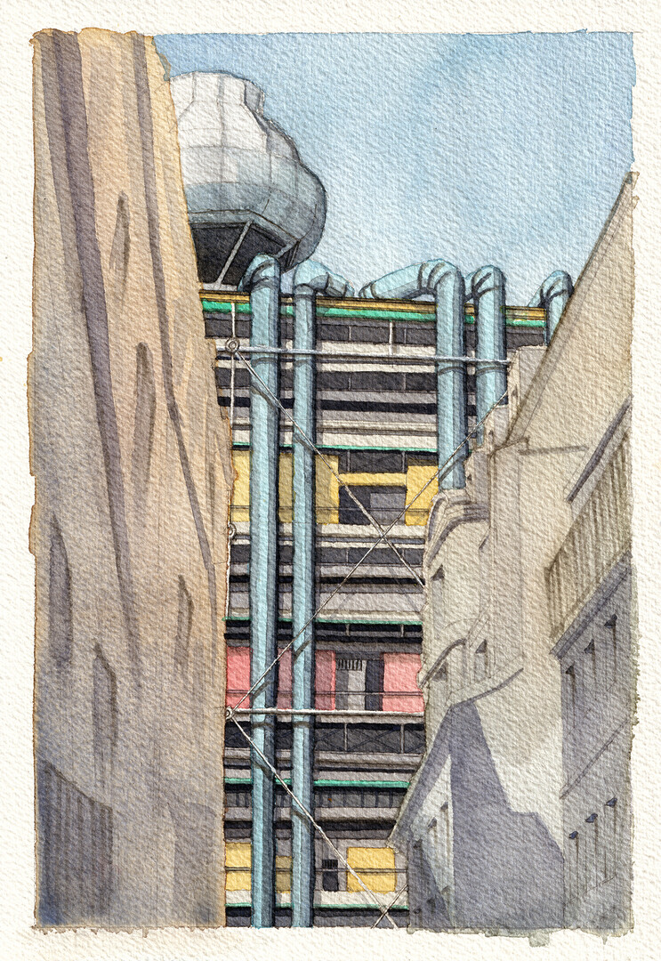
Super Pario, Pompidou, Paris
Watercolor Painting, 2025
Arches Fine Grain 10×12.5cm 300gsm
Rotring 800 Mechanical Pencil + Winsor & Newton Professional Watercolors + Schmincke Watercolors
Prints available HERE
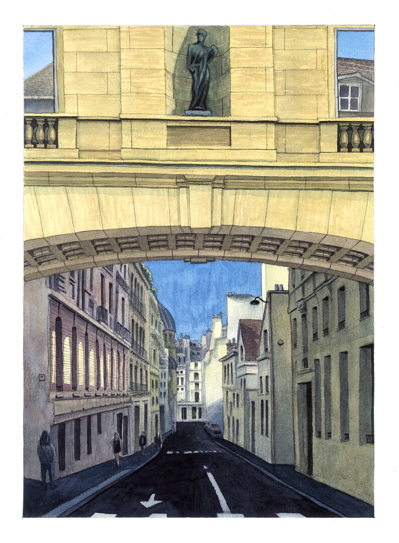
Rue Garanciere, Paris
Watercolor Painting, 2025
Arches Fine Grain 23x31cm 300gsm
Rotring 800 Mechanical Pencil + Winsor & Newton Professional Watercolors + Schmincke Watercolors
Prints available HERE
Cardinal Lemoine, Paris
Watercolor Painting, 2025
Arches Fine Grain 23x31cm 300gsm
Rotring 800 Mechanical Pencil + Winsor & Newton Professional Watercolors + Schmincke Watercolors
Prints available HERE
Pompidou, Paris
Watercolor Painting, 2025
Arches Fine Grain 18x26cm 300gsm
Rotring 800 Mechanical Pencil + Winsor & Newton Professional Watercolors + Schmincke Watercolors + Micron Fineliners
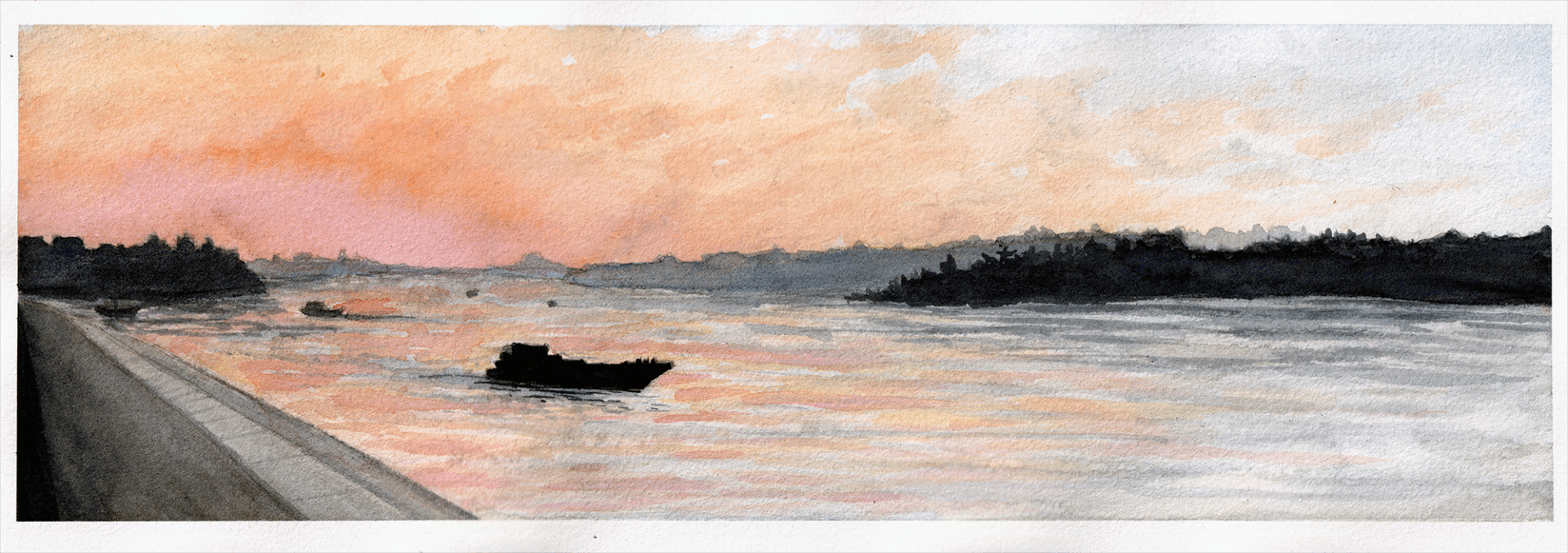
Pink Danube Sunset, Belgrade
Watercolor Painting, 2025
Arches Satin 10.5x30cm 300gsm
Rotring 800 Mechanical Pencil + Winsor & Newton Professional Watercolors + Schmincke Watercolors
Old Mill, Galata
Water Soluble Pastels Painting, 2025
Royal Talens Sketchbook 10x10cm
Caran d’Ache Neocolor ii Pastels
Hotel De Ville, Paris
Watercolor Painting, 2025
Arches Fine Grain 23x31cm 300gsm
Rotring 800 Mechanical Pencil + Winsor & Newton Professional Watercolors + Schmincke Watercolors
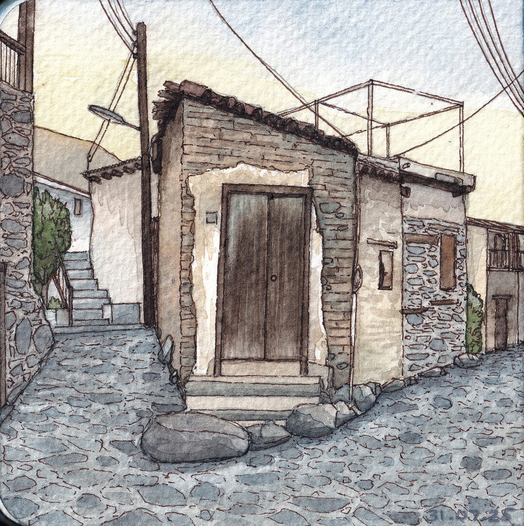
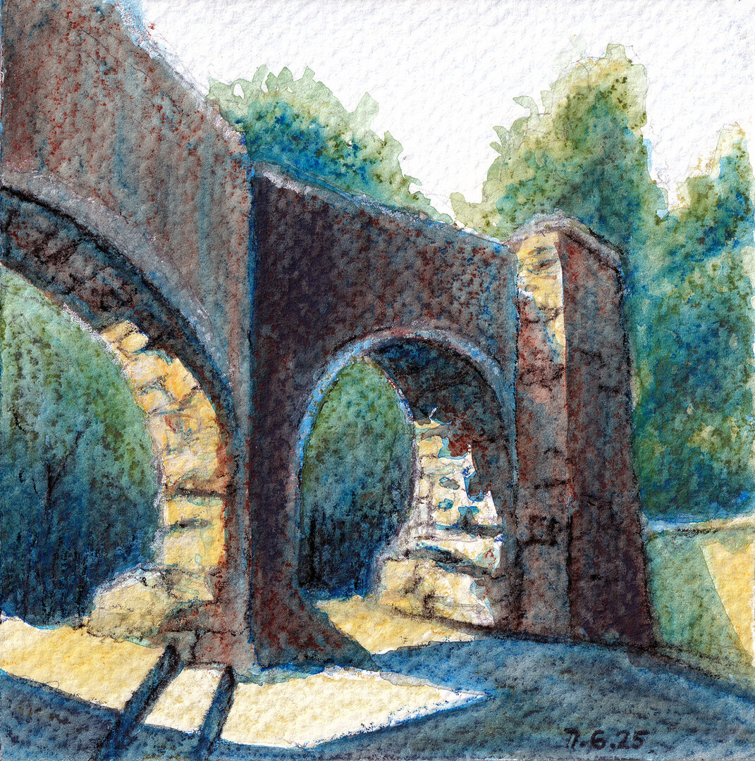
Old Kakopetria, Cyprus
Watercolor Painting, 2025
Arches Fine Grain 10×12.5cm 300gsm
Rotring 800 Mechanical Pencil + Winsor & Newton Professional Watercolors + Schmincke Watercolors + Micron Fineliners