January 9, 2026 — January 30, 2026.
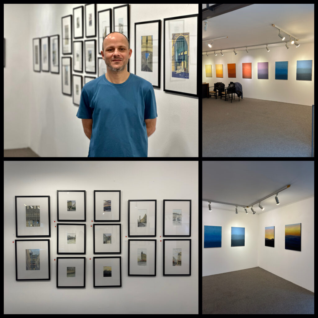
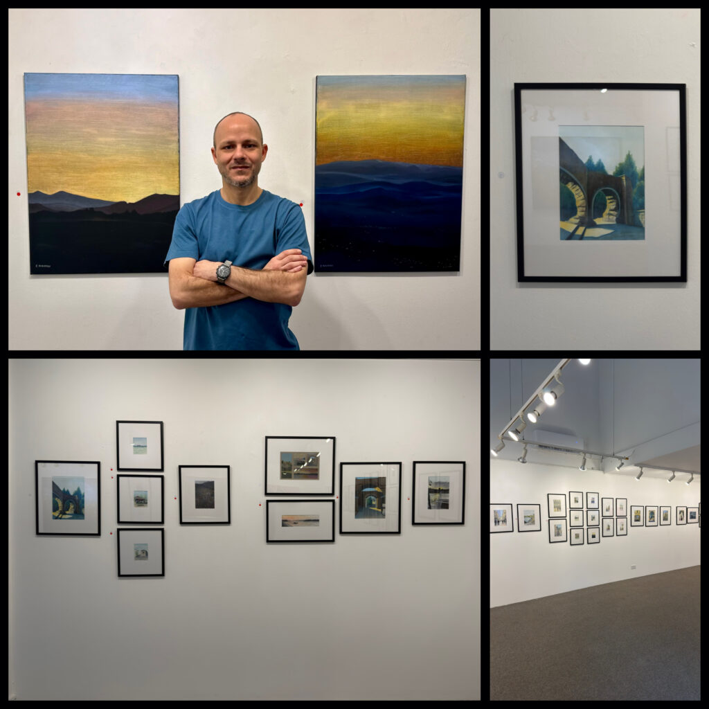
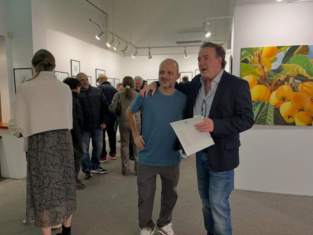
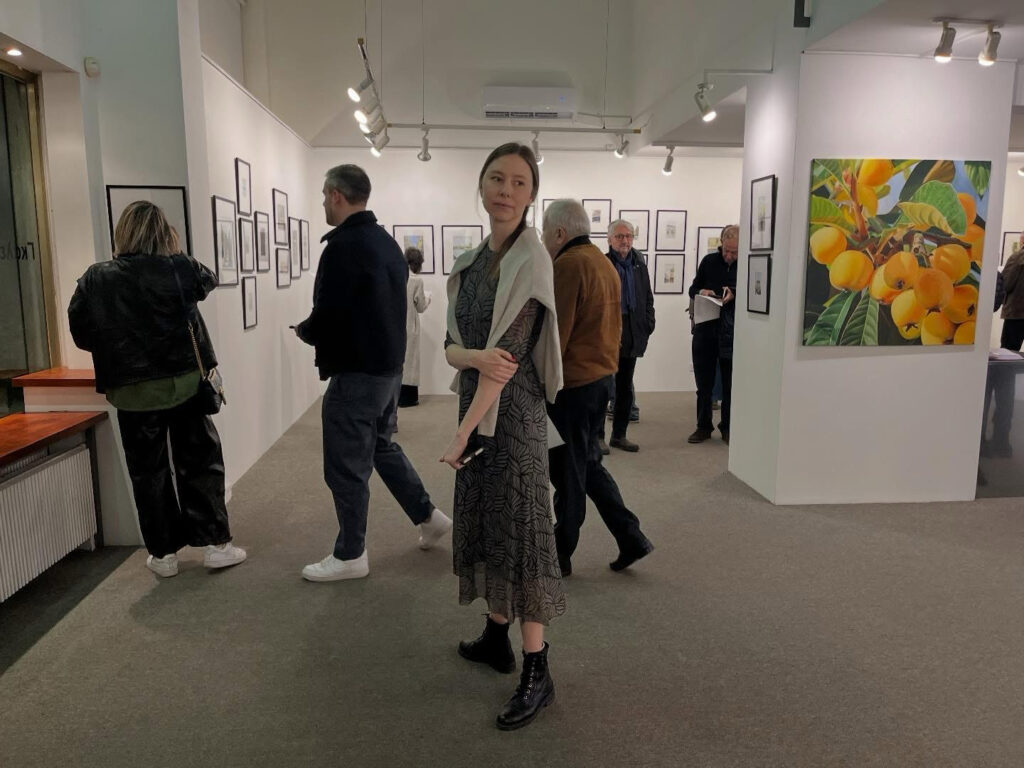
Gloria Gallery presents an exhibition by Stephanos Philippou and Anastasia Sivkova entitled “ANAMNESIS.”
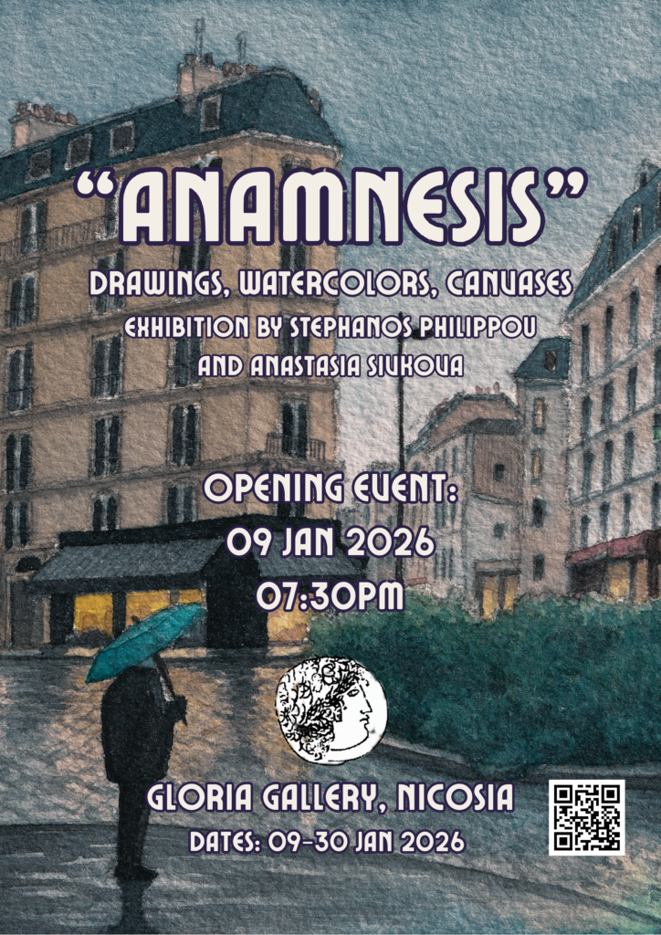
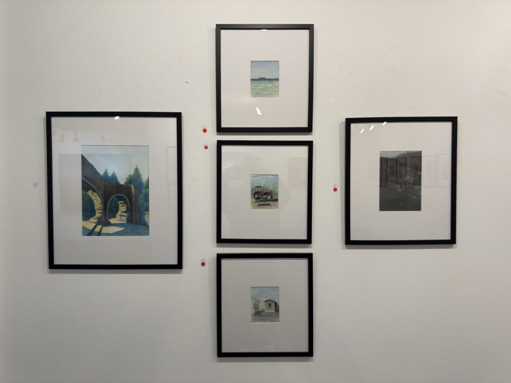
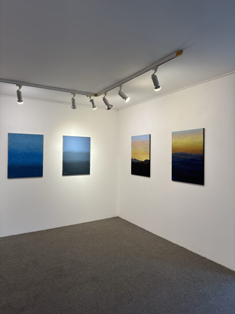
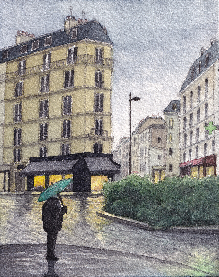
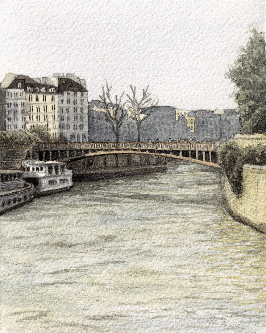
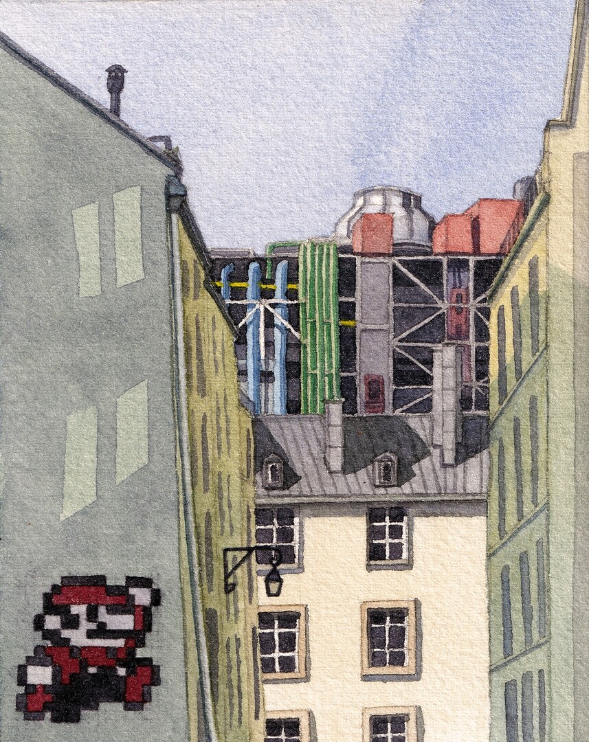
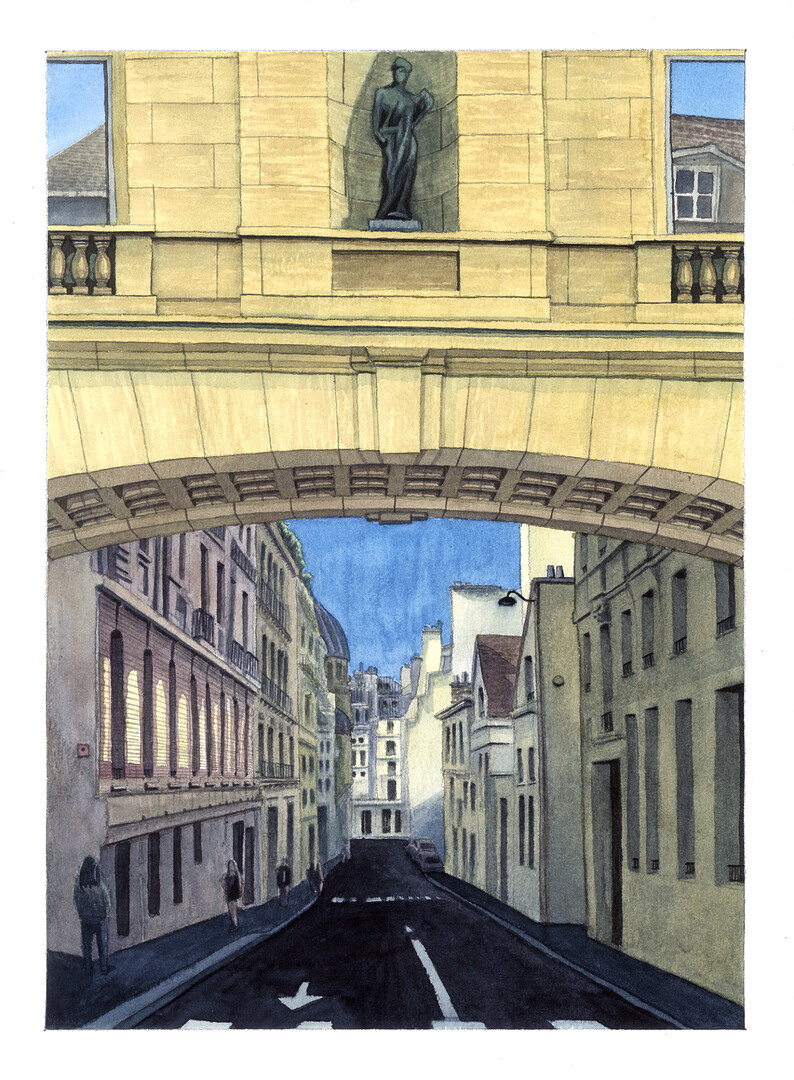
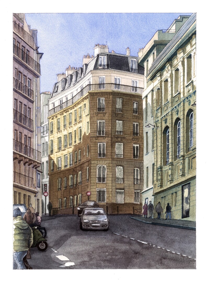
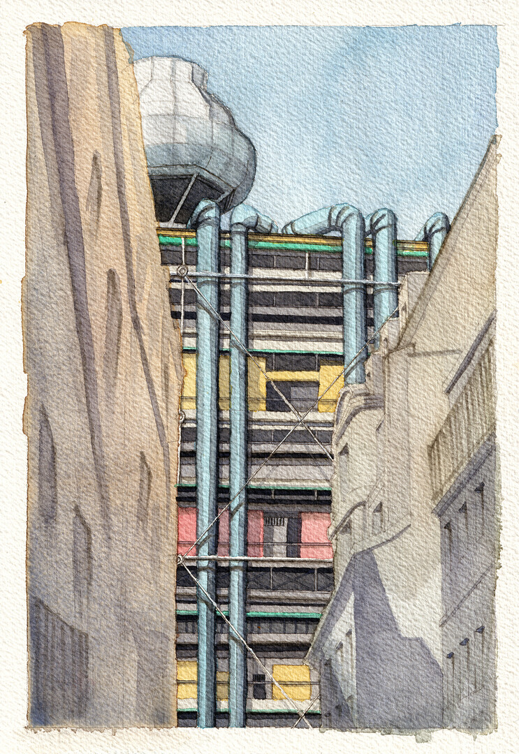
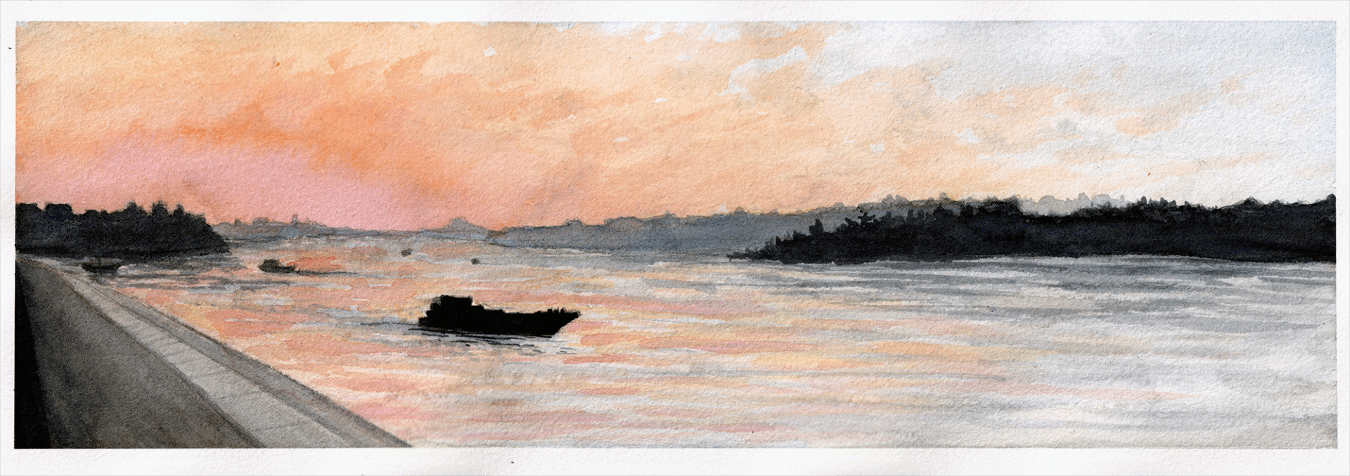
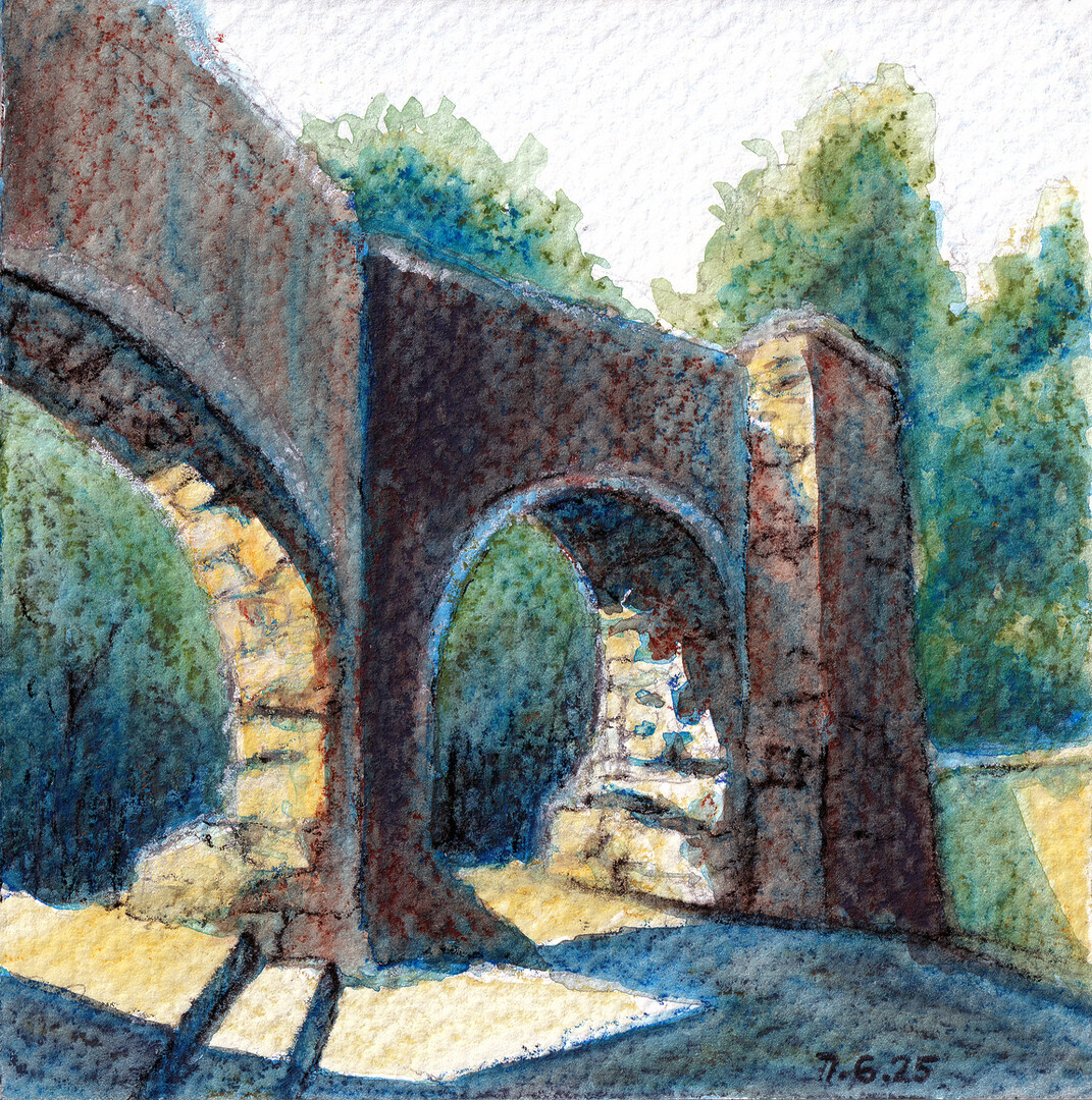
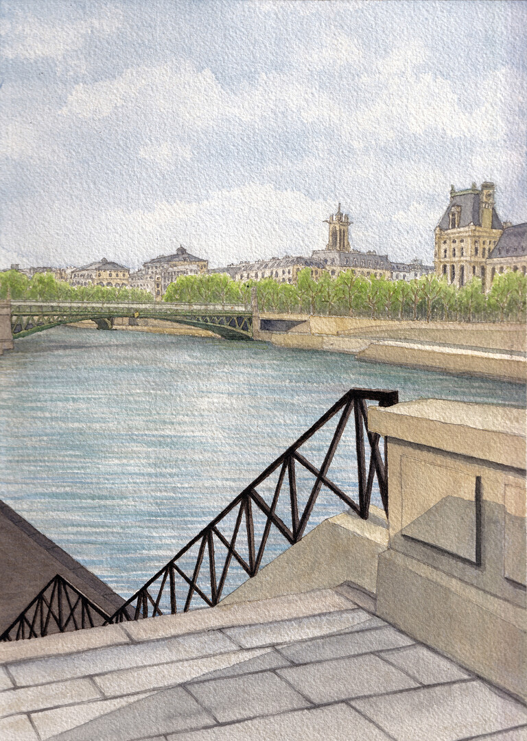
The exhibition features drawings, watercolors, and works on canvas in which the two artists explore memory as a living, fragile, and constantly changing experience.
The exhibition will open at Gloria Gallery on Friday, January 9, 2026, at 7:30 p.m.
Exhibition theme:
At the heart of the exhibition is the artists’ shared desire to capture moments before they disappear. Each work functions as a fragment of memory, shaped by personal experience, emotions, and sensory impressions.
Whether precise or expressive, the works serve as visual traces of places, moods, and fleeting moments that have left their mark. Through color, texture, and line, the artists offer a deep, introspective exploration of memory—how it is formed, dissolved, and reemerges.
The exhibition invites the viewer not only to look, but also to remember.